Apple Toolbox Fulfillment Redesign
Making it easier for customer service agents to track and view online order shipments.
Why redesign fulfillment?
Customer service agents frequently struggled to give customers real-time status updates within Apple Toolbox (ATB), Apple's internal order management system. Shipping and delivery questions were the third most common request agents handled.
The existing experience suffered from difficult navigation, a steep learning curve for new agents, fulfillment details scattered across the interface, and a fragmented workflow overall.
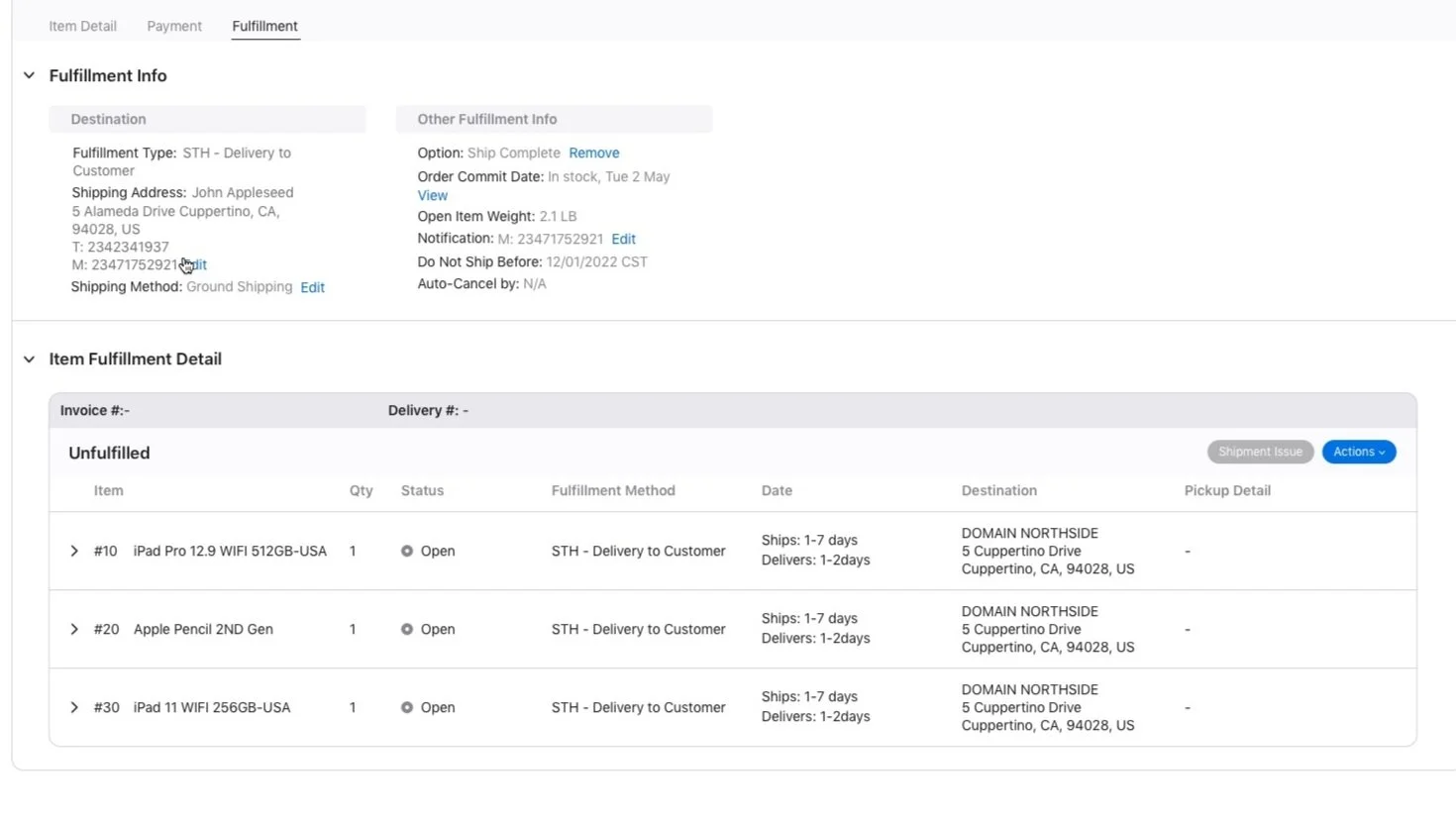
Order and item fulfillment details, organized into a single, clear view.
The goal
Give agents a unified fulfillment view, centralizing order and item information so specialists can resolve customer questions quickly — leading to a better customer experience overall.
Every item required its own click
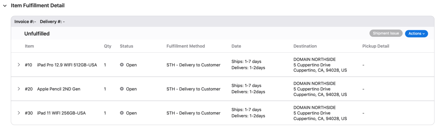
In the old design, taking action on an item meant clicking into it individually to see available options — cumbersome for agents managing multiple items on one order. I explored letting users select multiple items and then choose an action to apply across all of them, removing the need to open each item separately.
Research showed the available actions differed significantly between unfulfilled and fulfilled items, with little overlap. Based on that, I grouped call-to-actions by fulfillment status rather than combining everything into one section — so agents only see actions relevant to what they've actually selected.
One widget, five fulfillment types, no added complexity
A core challenge was integrating an existing "item level widget" that needed to work across five fulfillment variations (pick-up, IDL shipping, trade-ins, and more), stay adaptable for future options, and remain a single, cohesive element rather than splintering into separate UI per case.
I explored three UI options for what I named the "Edit Fulfillment Detail" widget, and chose the one that scaled to future actions without added complexity, tested as less visually complex for both stakeholders and users, and clearly communicated what agents could actually change — fulfillment type, address, or items — once something was selected.
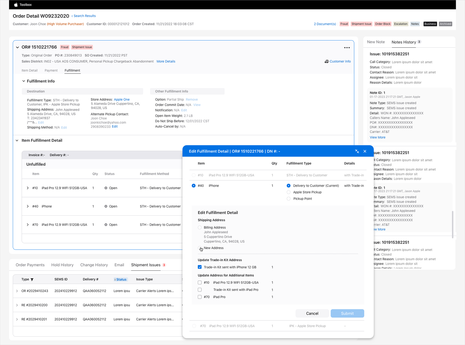
The "Edit Fulfillment Detail" widget, handling five fulfillment variations in one cohesive component.
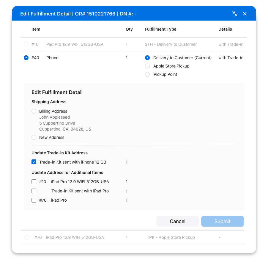
A closer look at the widget's shipping address and trade-in kit options.
Consolidating three widgets into one tab
Previously, specialists had to switch between multiple separate widgets just to answer a fulfillment question — slow and disruptive. I introduced a dedicated Fulfillment tab as a single source of truth, split into two clear sections: an order-level view covering all fulfillment types on the order, and an item-level view handling both unfulfilled and fulfilled states.
The consolidated flow: one path from order search to any fulfillment action, instead of three separate widgets.
Standardizing how agents take any action
Beyond fulfillment specifically, I wanted one consistent pattern for how specialists take any action across the whole Toolbox interface — while still being able to reference basic order info without losing their place.
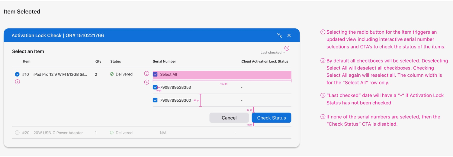
I drew inspiration from Gmail's compose window: anchored to the bottom of the screen, and minimizable while working elsewhere. Compared with modals and full-page flows, this bottom-anchored, collapsible pattern gave agents the flexibility to work across fulfillment, payments, trade-ins, and returns consistently, while keeping enough order context visible without it getting in the way.
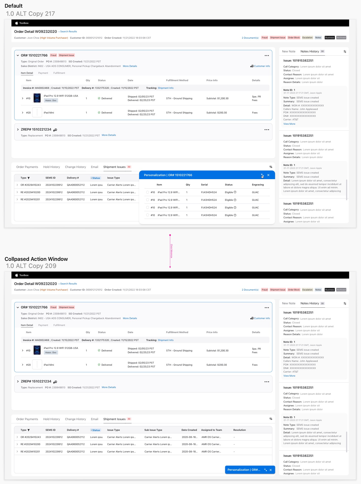
One consistent action pattern, reused across every flow in the Toolbox.
Before → after
Before, specialists relied on three different widgets for fulfillment information and actions, working through every step each time just to answer a single question. After, everything lives in one Fulfillment tab, consolidated into a coherent, organized view.
Task completion rates across the core flows tested, broken out by user proficiency.
Apple's engineering team is currently building out the design, and I ran thorough testing on a working prototype to make sure the build stays true to the design intent. It will be part of a pilot in 2025. I'm continuing to refine the fulfillment tab's structure based on further testing.