Mercato Ecommerce App
Redesigning Mercato's store home page, search, filtering, and checkout experiences on their mobile app.
Store, search, and checkout
I led the redesign of Mercato's mobile app store home page, search and filtering, and checkout flow, all launched in 2022. The work spanned how customers browse and discover products through to completing a purchase.
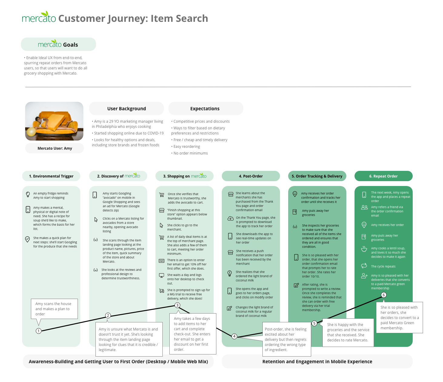
Mapping the full customer journey — from the trigger to shop through to becoming a repeat, paying member — grounded the redesign in where users were actually getting stuck.
Browsing, search, and filtering
Customers needed faster ways to find what they were looking for — by store, by category, or by specific product — without hitting empty, unhelpful search states along the way.
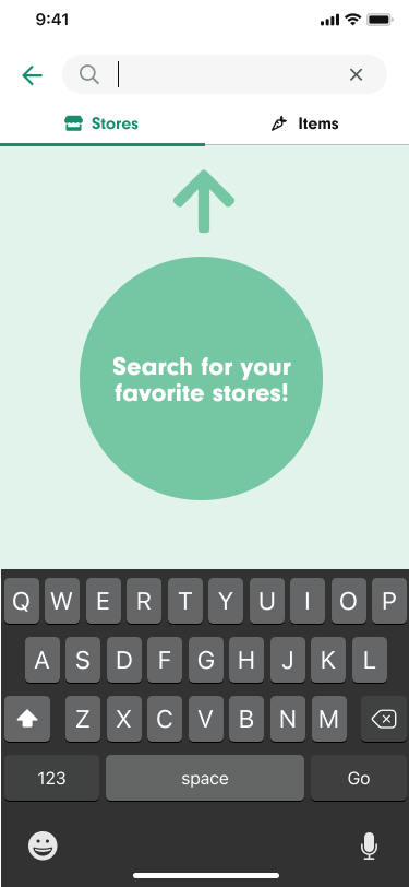
The search entry point — separate tabs for finding stores versus specific items.
The redesigned store page, with clearer category browsing up front.
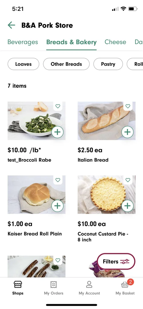
Browsing within a category, like Breads & Bakery.
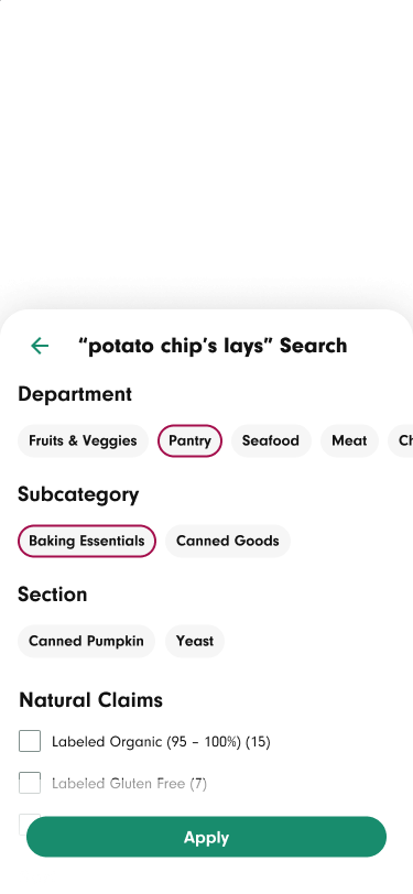
Layered filtering — department, subcategory, and section — helps narrow a broad search like "potato chips" quickly.
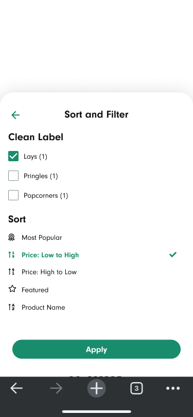
Sort and filter options, including brand-level filtering once a category is selected.
From cart to confirmation
The checkout flow walks customers through delivery or pickup details, payment, and any required verification (like age verification for alcohol), before confirming the order.
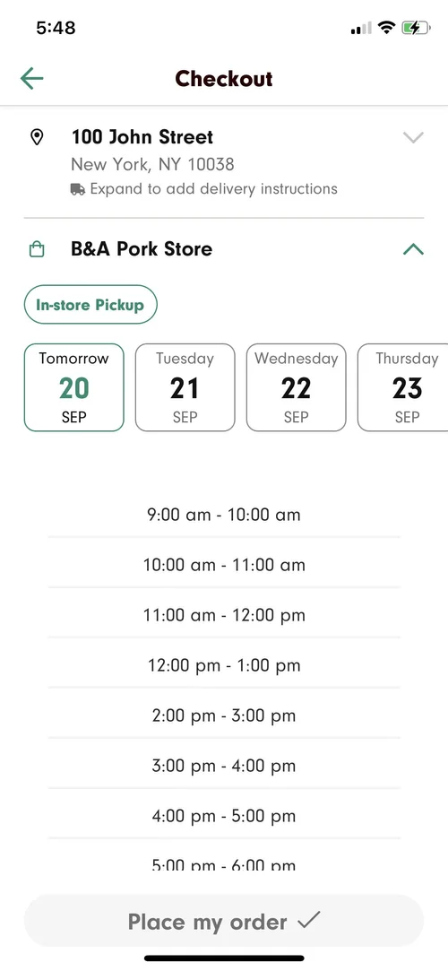
Selecting a pickup window during checkout.
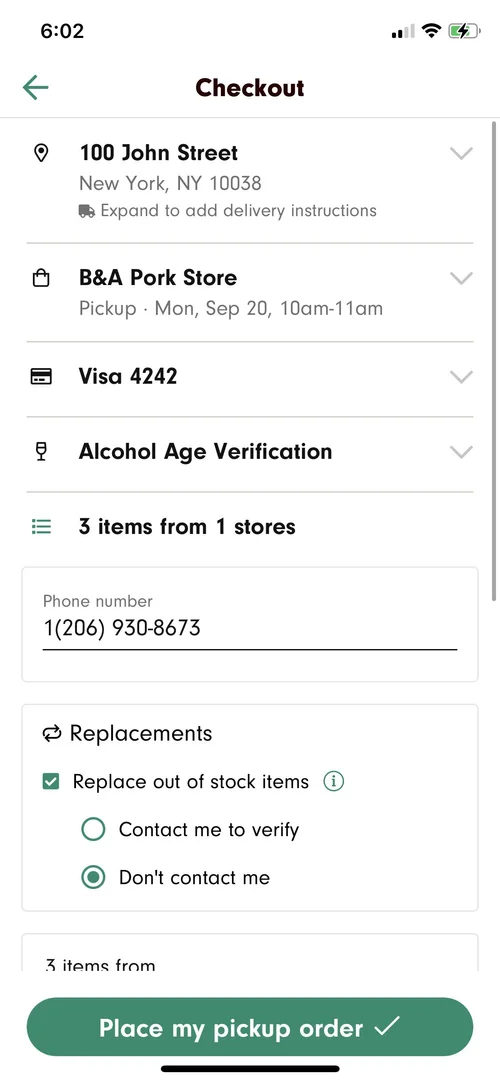
Payment, age verification, and substitution preferences, all confirmed before placing the order.
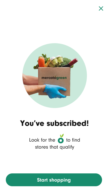
Confirmation after subscribing to Mercato Green, the paid membership tier.
Store redesign
Beyond the topline number, user feedback was strong: people reported the app was easier to use and navigate, specifically calling out how much easier the improved browsing and search made it to find what they were looking for.
"The recent improvement of including the ability to search by food categories makes a huge difference." — Amy, app user
Checkout redesign
The redesign also removed a specific drop-off point at the tip selection step, which had been causing users to abandon checkout partway through.