Apple Toolbox Returns Redesign
Simplifying the return process for online orders within Apple's internal customer service system.
Why redesign returns?
Returns is tied for the #1 most-used flow in Apple Toolbox (ATB), Apple's internal order management system used by global customer service agents to handle real-time chat, verify information, locate orders, and process requests.
ATB was difficult to use, with complex navigation and information structure. Returns specifically were time-consuming, and new agents took months to learn the system — hurting efficiency, performance, and the customer experience.
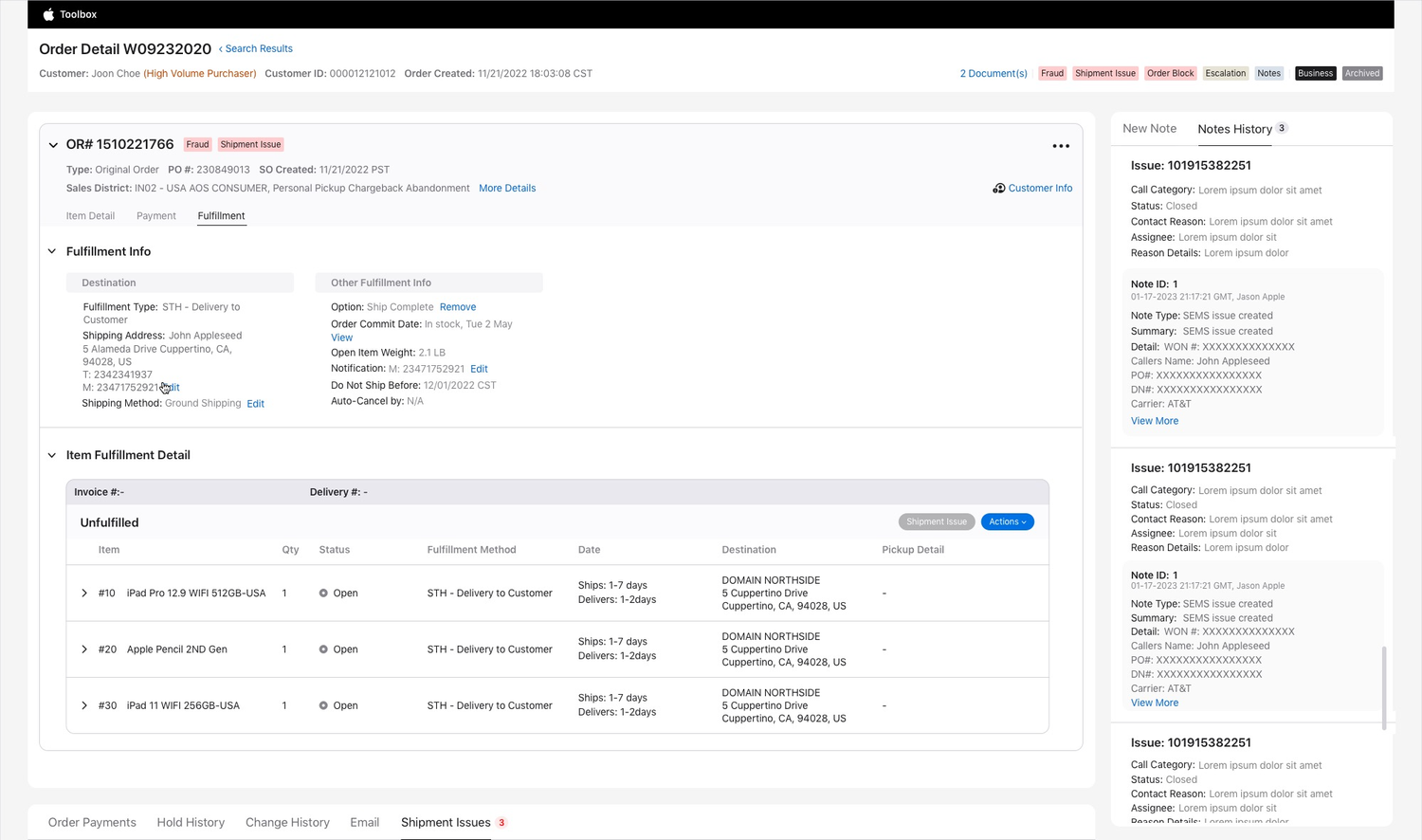
The order detail screen agents start from — this is where a return begins.
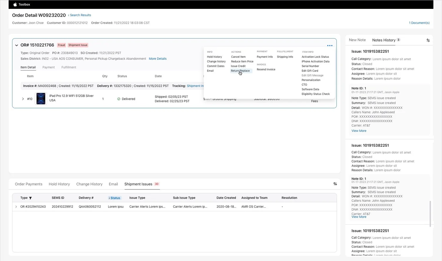
The redesigned flow: agents now select "Return/Replace" from the kebab menu, with unnecessary steps removed and clearer language throughout.
The goal
Streamline returns to empower agents, reduce handle time, and improve customer satisfaction.
Too many steps to start a return
Agents reported the return process was time-consuming and full of unnecessary steps. Breaking down the specific friction points:
- Information overload — agents had to search through numerous documents to find the one related to the return.
- Product confusion — hundreds of items with near-identical names, differing only by color, made it hard to identify the exact product.
- Invoice hunt — multiple invoices might be linked to a customer, and agents had to find the correct one.
- Unintuitive interface — the return process relied on an unclear icon to represent the function.
In the new design, agents can immediately identify the correct documents and initiate a return or replacement. The redesign minimizes steps, focuses attention, and organizes information logically.
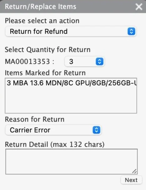
Before: the legacy return panel relied on an unclear icon and multiple dropdown steps.
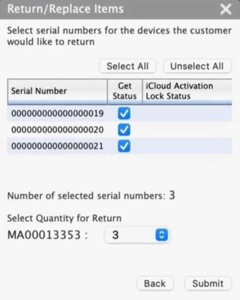
Before: selecting serial numbers for a return was a separate, manual step.
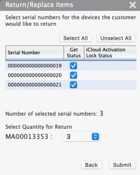
The same legacy step, showing the full serial number list before a selection is made.
Selecting the right item and quantity was confusing
Usability testing showed agents struggled to select the correct items and quantities during a return. Previously, entering separate quantities and serial numbers was a common point of confusion.
My hypothesis: progressive disclosure — hiding unnecessary detail until it's needed — would simplify the interface. In the new flow, item and quantity selection happens in a single fly-in, quantity and serial number (where applicable) are retrieved automatically, and three previously separate steps are combined into one. This reduces steps for multi-serial-number returns and improves clarity overall.
Item, quantity, and serial number selection combined into a single progressive-disclosure step.
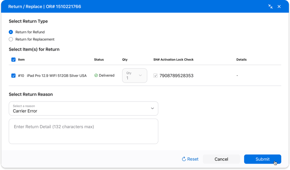
The completed flow: item, reason, and detail selected, ready to submit.
Removing a redundant step without removing a safeguard
There were two ways to check Activation Lock on a return: a separate check before starting the return, and an automatic check during the return itself. Specialists preferred the separate check, to avoid surprises later.
I considered making the Activation Lock check optional within the return flow, so users could see the status before submitting. I ultimately decided against it — keeping it as a separate, dedicated action avoids adding unnecessary steps to the return itself and keeps agents focused on the task at hand. In the new design, the only place to manually check Activation Lock is a dedicated widget, rather than a step buried inside the return flow.
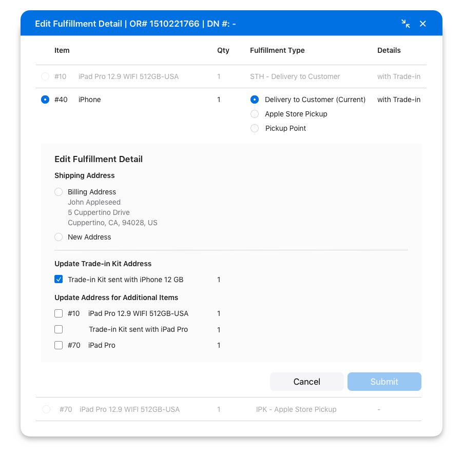
The dedicated Activation Lock Check widget, annotated for engineering handoff.
Testing the design
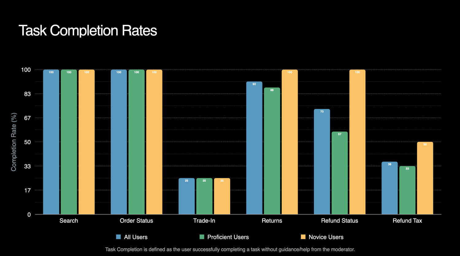
I tested the new design by observing how Apple agents interacted with it in usability sessions. Twelve specialists took part, evaluating the core experience across Returns, Payments, and Trade-In flows.
Five users, unprompted, said they liked the design. Specialists described it as "so much simpler" and said it "seems way easier to learn."
Findings & follow-ups
Three users noted there was too much scrolling across the broader application. That's a real finding, but it sits outside the scope of the returns project specifically, so it's being tracked as a separate initiative rather than folded into this redesign.
This version of the design is currently in development and will be part of a pilot in 2026.